Logo Design Trends 2022: The Future of Logos
Do logo trends really exist, and if so, what’s the best way to approach logo design in 2022?
Logo design trends are something mythical: almost everyone speaks and writes about them. But have you ever seen them in action? While there’re so many creators building up their tips on how you should better approach logo design, we’ve decided to check up with what real businesses do and sum it up as ten major logo trends that will probably work in 2022.
So what’s going on in the industry? As with general design trends, every year, we seek significant trends for logo design, trying to help designers and entrepreneurs onboard fresh and distinctive brand identity. More or fewer colors, flat style or 3D, minimalism or maximalism — over and over again, it’s the same choice for everyone. The funniest thing is that even when the choice is made, nobody has a keen understanding of how an engaging modern logo should look like and keeps doing things their way.
In fact, every time there comes a powerful trend — as it happened a few years ago with reserved flower-based logos in Scandinavian style — there are always thousands of studios that overlook it. The same happens in other creative fields (or. even outside the design industry), but logo design makes it particularly evident that any trend carries thousands of exceptions.
That’s why I don’t recommend you to focus on popular trends everyone’s about and see for yourself what’s what. To help you with that, we’ve explored hundreds of loud rebrandings of 2021 to make up an honest list of logo trends that most designers stick to. That must be of great help if you don’t know what to start with!
Logo Design Trends 2022: Overview
In 2021 logo designers made a huge step towards a bolder and more innovative design. Similar to graphic design trends, branding intensively adopted soft looped animations and vibrant color schemes. It also opened up to experimental typography, which encouraged creative minds to take a fresh look at logo design.
In 2022 logo design trends are likely to continue the general tendency, and we hope to see the aforementioned aesthetics globally reinvented. Previously, it was elementary to tell a trendy logo from an outdated one — now, things will change drastically. You’ll see designers equally opting for minimalism and cartoon logos, 3D and flat logos, floristry, and wordmark logos. We thought 2021 was going to be the year of creative freedom. However, it looks like in 2022, we will see it truly unrestrained.
- Simplistic Geometry & Basic Shapes
- Tall Logos (new)
- Saturated Colors & Gradients
- Symbolism & Minimalism Instead of Realism
- Scribbles & Sketches
- Bold Wordmark Logos
- Sans Serif Logos
- Floristry & Subtle Decor
- Black & White Logos
- 3D vs Flat Style
Simplistic Geometry & Basic Shapes
In 2022 you will hardly surprise anyone with a logo based on a complex logomark. Such logos are usually hard to remember, and customers may find it challenging to build a bond between the brand and its graphic representation. This can be a huge problem for big businesses seeking to reinforce their presence and increase brand awareness. Therefore, there is a tendency for the companies to refuse such logo marks in favor of something fundamental.
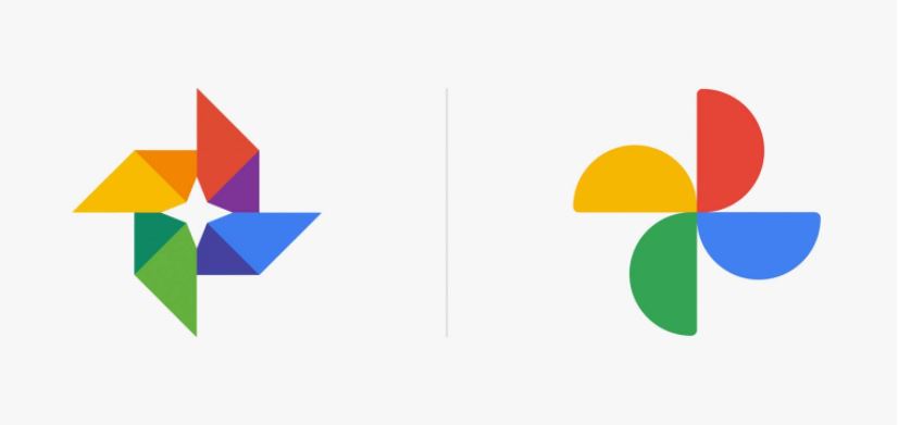
Basic geometric shapes are various triangles, circles, squares, dots, and lines which bring logo designs to a simplistic image. In compensation, designers suggest using a vibrant or distinctive color scheme (which is sometimes associated with a brand even better than the logo itself). Or, on the contrary, switch to the black & white and bring this minimalist effect to maximum. Finally, there is negative space, which is another great way to adopt simple geometry, and sustain visual interest (this trick can be featured as one of the focal micro-logo trends, loved by many brands).
The principle “Less is more” isn’t new in design, and neither is this logo design trend. But what makes it worth our special attention is that more and more large companies like KIA or Google refer to basic shapes and redesign their logos — which initially were quite simple and reserved. By doing so, they obtain a super concise, fresh image that won’t overcharge the customer with odd details to memorize and attach to the brand.
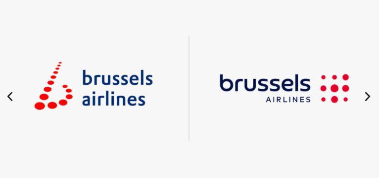
It’s vital to note that the logo trend of basic geometry & simple shapes doesn’t strictly refer to logomarks. In fact, it is about fonts too — but this happens less frequently and is more associated with the global typography trends and the overall popularity of minimalist types.
Tall Logos
While most logo design trends in 2022 resonate with everything we used to have two, three, or five years ago, tall logos are like a gulp of fresh air and creativity. Narrow and vertical, they oppose themselves to the overused horizontal, square, and circle logo marks. Rotation alone has inspired hundreds of designers at least to play with them. And as we can see from multiple Behance projects, their aesthetics is exceptionally suitable for fashion companies, boutiques, creative studios and big brands that seek to be on edge.
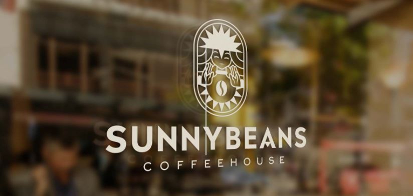
Tall logos were partially borrowed from Art Deco, where there was a particular love for elegant vertical frames. However, it would be incorrect to refer them uniquely to this movement. Tall logos equally feature the Boho aesthetics (which is extremely popular in 2021-2022) and modern geometrical elements. In fact, the roots of this logo design trend aren’t so important. What really matters is that the new shape made designers come up with fresh logo ideas, so here we expect them even to approach fonts and graphic elements differently. For instance, they are already playing with line thickness, display and simple typefaces for most winning solutions that would generate more emphasis on the brand’s message.
Another important feature of the tall logo for businesses is that it fits most online marketplaces and advertising better than classic logos do. Only switching to a tall logo eliminates the need for multiple same-style versions and logo designs for the sake of responsively — as a rule, it is responsive as is.
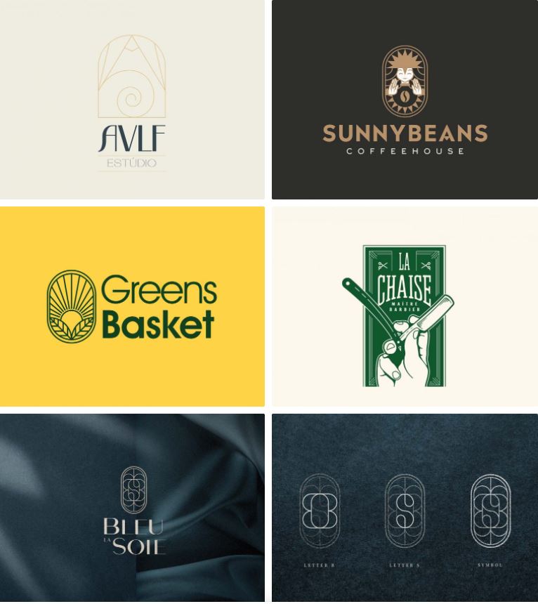
Hand-picked cases:
- Sunnybeans Coffee Brand Identity
- Barber Shop logo concept
- Super Market Identity Design
- AVLF Identidade Visual
- Bleu la Soie – Brand Identity
Saturated Colors & Gradients
Practice shows that the work with color and the choice of the color palette for a logo is a very personal story, and it’s usually hard to track the global tendency or any logo trends associated with particular colors. Someone prefers black & white logos (which we’ll discuss later). Someone chooses monochrome, nude or earthy colors, which are particularly popular nowadays. However, if we look at big brands, we’ll be able to define a vast trend using vivid, saturated colors in logo design.
If you think that designers went cold on the color, the experience of Abbyy, Baskin Robbins, and others proves otherwise. The interest in the colors in logo design has grown to the point where creators don’t just increase the saturation but choose pure, vivid solutions while simplifying the logo as much they can. Too many details and colors can create a messy look, so it’s vital to select one or the other — and in times of minimalism, the choice is clear. However, We can’t help highlighting that vivid colors are difficult to work with — and the candy colors in particular. They can make the brand identity look cheap and even amateur. So as you have your eyes on this logo design trend, it’s important to strike a balance — or you risk staying with a dubious logo.
Another aspect of this trend is gradients, which are just gaining momentum. It seemed that designers would never get back to them — but then, in 2020, followed a whole series of redesign projects centered around gradient logos, from two-color gradients of Facebook Messenger or Avon to a complete gradient rainbow of Discovery channel and Adobe’s main logo (wonder if there’ll be any changes with Adobe Photoshop’s and other CC apps’ branding).
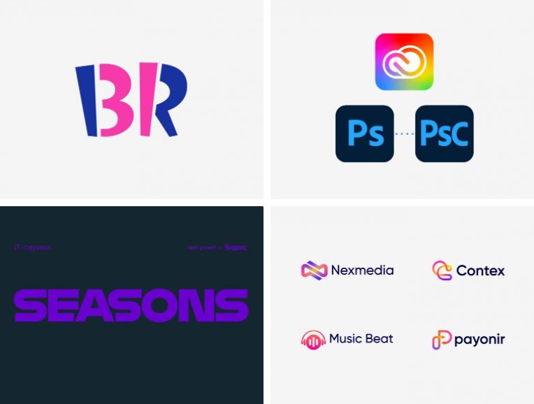
Hand-picked cases:
- New Avon logo revealed
- New Logo and Identity for Baskin Robbins
- Adobe will now Update its Update
- Seasons Brand Identity
Symbolism & Minimalism Instead of Realism
There are multiple logo trends related to simplifying logos and minimalism — and probably this one is the most illustrative of all. Every one of us has in mind the logos created as a genuine piece of art. Animals, florals, mythical objects and creatures, coats of arms — inside the logo, they demonstrate mastership and fascinating attention to detail. True, such logos really look striking (as long as the image is high-quality, of course), but they lose other types of logos from the point of responsive design.
You probably remember responsive logos, the term which was introduced around 3 or 4 years ago. These were the logos that could be adapted to the varying screen size or another medium. For this purpose, designers could remove the wordmark, simplify or hide the logomark. Today hardly anyone considers responsive logos as an independent phenomenon or trend. Instead, responsiveness is a natural feature of a logo, and the movement of symbolism and minimalism just proves it.
Realistic logomarks are pretty cumbersome and inconvenient, especially when placed on smaller screens or compact business cards. And here come the simplified versions or brand new minimalist logos, which save lots of designers’ time and effort. They make it possible to create a single logo design that will look well everywhere — or it will be less tricky to divide it into separate elements. Mainly, this logo trend isn’t about visual beauty and style but convenience. A symbol-based logo is far more flexible, and its delicate appearance is a bonus, not an end in itself.
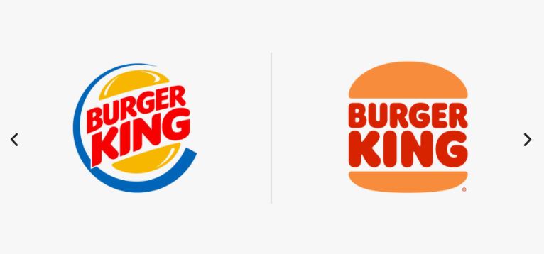
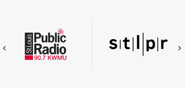
Hand-picked cases:
- New Logo and Identity for Papa Johns
- New Name and Logo for Ponto
- New Logo and Identity for St. Louis Public Radio
- New Logo and Identity for Perm Polytech
- New Logo and Identity for Burger King
Scribbles & Sketches
In 2022 scribbles, sketches and doodling return as a graphic design trend, so their apparition as a separate logo design trend shouldn’t surprise you. Although it seems that freeform drawing has already exhausted itself, recent projects demonstrate right the opposite. The key to its revival is the increased interest in a designer’s personal approach to the brand. And apparently, there’s hardly anything better for that than fast sketches, cartoon characters, and shapes drawn in a unique style.
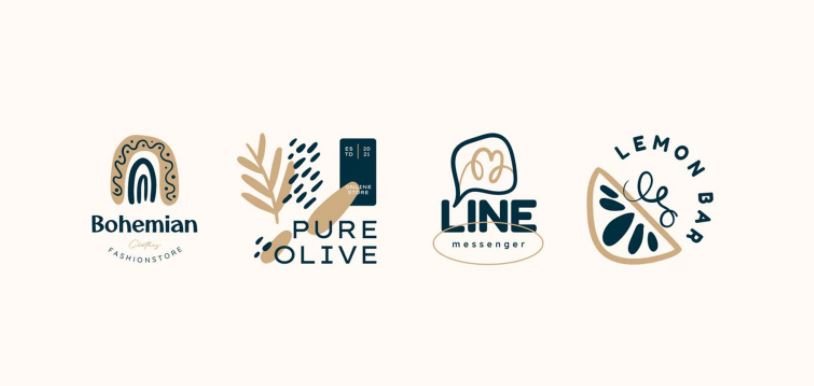
Therefore, be prepared for more scribbles in logo design as well as sloppy cartoon logos, and fast-drawn mascots in corporate branding. Hand-drawn logos, produced in a fast and unpretentious manner are welcome too, and we’ve already seen projects and teams that have their brand name written this way.
All of the metioned logo designs will be celebrating the raw, unfinished look. And even if you are a passionate lover of clean minimalism and traditional logo aesthetics, for some brands, such a throwback from the mid-2010s will be the best way to deliver their aesthetics.
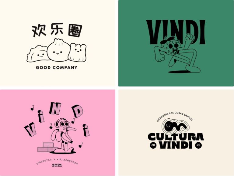
Hand-picked cases:
- Doodle Boho Logo
- Good Co. Logo & Branding
- Cultura Vindi 2021
Bold Wordmark Logos
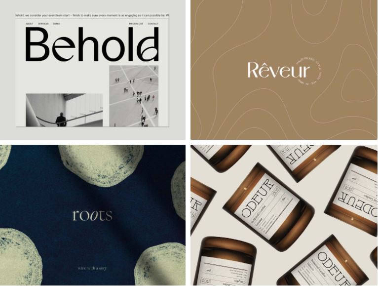
If we consider logo design trends that came in 2021, bold wordmark logos will be the best example. Introduced at the end of 2020, experimental typography projects focus on uncommon geometry solutions and proportions. They also praise visual imperfections making them the new black in the eyes of the creative community. No wonder that branding and logo designers couldn’t overlook this massive graphic design innovation — and here we’ve got an all-new direction in logo design.
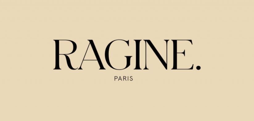
Lots of global companies choose wordmark logos. H&M, Coca-Cola, Zara, Google, Visa — the list is almost endless. However, hardly any of them seriously think of rebranding using experimental fonts — at least, for now. That’s why such wordmark logos are mainly spread among indie studios, small businesses, boutiques, salons, and individual creators. And probably, the niche character of these bold logos is another key to their attractiveness. You can treat them as the logos for connoisseurs who know what to pay attention to — or for those who intend to feel the brand’s aesthetic (instead of just being guided by the consumerist patterns).
Searching for inspiration, it makes sense to check Behance projects. There are lots and lots of studios actively playing with experimental typography and trying it for branding purposes — so you’ll probably come across someone who will share your personal feel of perfection. On the other hand, as the world is now more and more interested in graphic design tendencies and logo design trends imposed by the leaders of the industry, we can count on some big companies to redesign their wordmark logo using trendy experimental fonts.
Hand-picked cases:
- Ragine – Visual Identity
- Behold
- Roots
- Odeur Botanical Candles Branding
- Rêveur Brand Identity
Sans Serif Logos
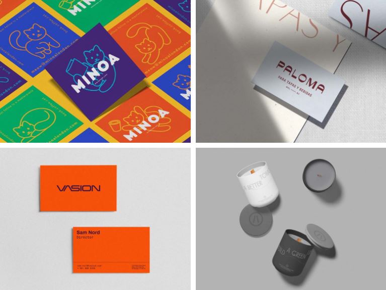
While the use of bold experimental typography isn’t a trend for everyone, sans serif fonts are the story that everyone knows and understands. It’s been quite a while since designers refuse fancy scripts and serifs in favor of sans serifs. This process has already slowed down a little. But as there is a general tendency, we can state that it’s still a logo design trend for 2021 — which, by the way, is supported by the popularity of minimalism and basic geometry we wrote about above.
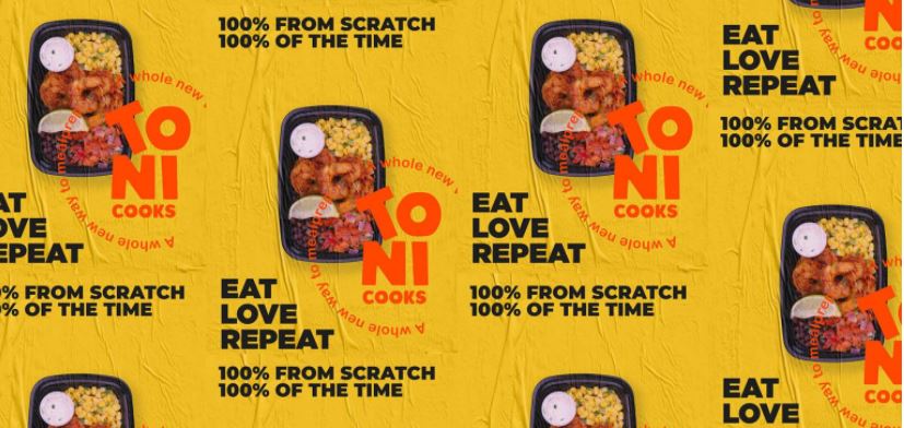
The motivation to refuse fancy fonts is extremely simple — it’s much easier to work with sans serif fonts. It’s less complicated to adapt them to different screens and canvas sizes, so they fit responsive logos more. What’s funny is that a couple of years ago, we observed an opposite process: many companies switched from sans serifs to serifs, as there was huge popularity of the retro design. Today, as the retromania is slowly releasing its grip, the healthy pragmatism comes up, and sans serifs are relevant again.
If you think that a sans serif logo is boring, it’s likely that you haven’t sensed the incredible variety of fonts with tons of geometry features, weights, color solutions — as well as outline styles and lowercase-letters-only logo designs. Will it be a logo for a mass-market brand or something very niche and unique — sometimes, even using the same font, it’s possible to create completely different branding. So don’t be skeptical!
Hand-picked cases:
- ToniCooks Brand identity design & Packaging
- M I N O A
- Paloma – Tapas Restaurant
- Vasion
- ROOF STATION-BRANDING
Floristry & Subtle Decor
I have lost count of how many years designers and product creators make series of logos in the minimalist or Scandinavian style. Along with that, lots of small businesses keep choosing and using them, so these logos are not going to lean back — as if they have just appeared on the market. So rest assured, they will stay with you for another couple of seasons, yet regularly enriched by new styles, like the all-the-rage Boho in 2022.
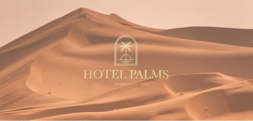
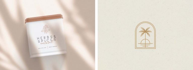
Probably, this logo design trend is the most popular of all. Its fragile floral motives, wreaths, frames, branches, and elegant lines look absolutely fascinating, so the temptation to use them is great. It was so in 2019, and the situation stays the same in 2022. In fact, this subtle visual style isn’t solely focused on floristry. There is plenty of items of daily use: from furniture to stationery and clothing. Everything that matters is how these logo templates are made!
Because of the massive production, there are many logos of the kind, and they can be cookie-cutter (which isn’t necessarily like that, of course). However, if your goal is to provide yourself with a beautiful logo without spending too much time on it — and if you don’t intend to be one in a million with your design — that’s a good option. That’s why Scandinavian and more recent Boho logos remain popular for boutiques, coffee shops, bars, and wedding decor. And that’s why the designers can’t stop themselves from seeking the most refined images for their new logo concepts.
Hand-picked cases:
- Hotel Palms Branding
- Floral Line Art Logo Set
Black & White Logos
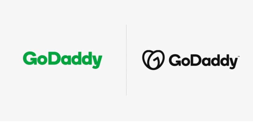
As we continue reviewing minimalism in all aspects, let’s pass on another confident trend for 2022 in this niche: black & white logos. Actually, it’s quite weird to consider black & white color palette as a trend, as it’s a classical solution, and it exists irrespectively of time and stylistic changes. And still, it would be wrong not to draw your attention to an increased interest in such logos, where the most significant example is the one of GoDaddy’s redesign. They gradually simplified their logo, and now they seem to reach the final stage — coming with the black & white logo with a sans serif font and a reserved logo mark.
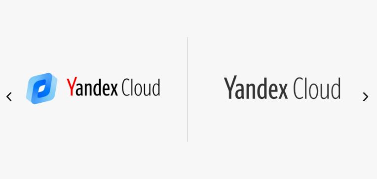
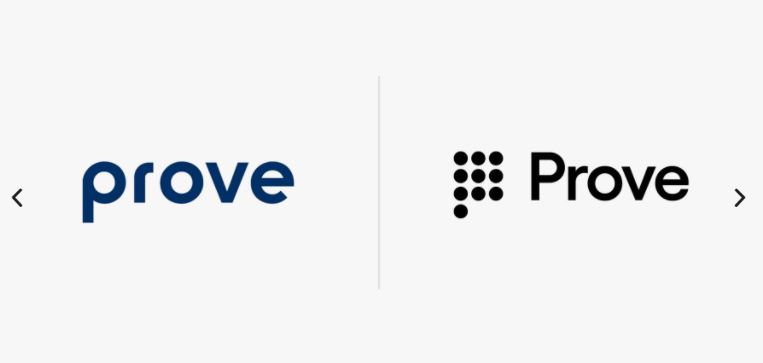
The best thing about the black & white logos, which makes them come through the new wave of popularity among branding designers, is their incredible stylistic flexibility. They perfectly adapt to the brand’s aesthetic, so it’s possible to use them for various experiments with fonts, decorative elements, and geometry. As a matter of fact, such logs are in the limelight because of their versatility — and also because of other logo design trends that are all the rage now. Minimalist, inventive typography, floristry, symbolism, primitive geometry — everything pairs well with the black & white logos.
Hand-picked cases:
- New Logo and Identity for GoDaddy
- New Logo and Identity for Prove by Mucho
- New Logo and On-air Look for ABC
- New Logo and Identity for Yandex.Cloud
3D vs Flat Style
3D was one of the promising graphic design trends for the year 2021. With the development of technologies, such graphics has become so massive that we could never foresee it. The making of quality 3D objects can even be jury-rigged in the intuitive Spline or the recent update for Procreate. The quality of images has evolved as well. They now stun and fascinate with their realizable realism — which seemed to be available only for Pixar before (yeah, all those tiny fibers and specs of dust).
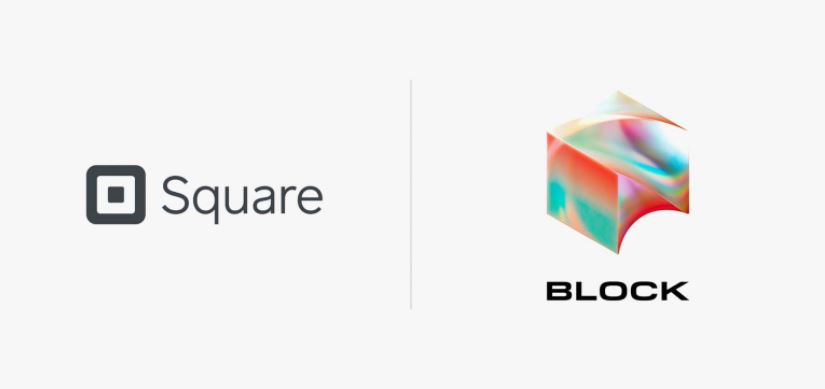
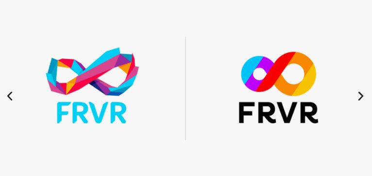
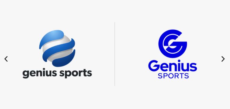
However, in logo design, the situation is quite controversial. Designers transform flat-style logos to 3D and vice versa, seeking to make the logo style more vibrant and less cumbersome — the latter was particularly typical for the older version of 3D and fake 3D. For the same reason, they bring lots of their efforts to explore a direction similar to 3D — isometric art. It allows obtaining a voluminous image with the help of optic illusions, vibrant colors, gradients, shadows, and shapes. Probably, it looks more applicable to logo design than 3D — but the time will show what companies and customers will get used to more.
3D logos are a great chance to try luck and skills in the new technique since the flat design isn’t a terra incognita anymore. It’s still an open question whether this design trend will ever transform into a complete logo design trend in the nearest future because according to redesigns on Brand New, flat style is still prevalent. What we really have now is this unstable situation where some teams redesign their 3D logos, and others are just discovering this technique and trying it for branding.
Hand-picked cases:
- New Name and Logo for Block
- New Logo and Identity for Liberis
- New Logo and Identity for Genius Sports
- New Logo and Identity for FRVR
Logo Trends to Leave in 2021
Obviously, there is no clear boundary that would separate the logo design trends of 2022 and 2021. Most of the trends that are at their peak have been with us for quite a while, so you shouldn’t expect any global changes.
However, we can safely say that, for example, glitch, which was extremely popular before, is unlikely to become the main character of the logo design this season. There has been quite a lot of it in the last few years, so the community has got tired of it. The same happened to animated logos, which were one of the most promising logo trends back in 2021. By itself, animation continues to arouse interest, and this is a winning technique for the presentation of branding — but unfortunately, it didn’t prove viable. Since animated logos are applicable only in digital, the inability to go out to the masses played a cruel joke on them, and the main feature — animation — became a disadvantage.
Finally, the fate of 3D hasn’t been determined either, and we cannot yet say whether 3D or flat-style logo designs will become a trend. We have already written that the designers’ position is ambiguous, and there are rebrandings both in one direction and in the other. We hope that there will be a final decision of which of them will leave this year and which will stay for a couple of seasons ahead.
These logo examples give us a better idea on how the logo design trends have been shifting.
Companies and businesses who are looking for a logo rebranding or a logo redesign can go with a reputable logo design company that is able to provide different design concepts with unlimited revisions until the client is completely satisfied.
ArtArticle Credit : Ksenia Pedchenko / The Design Nest